Components
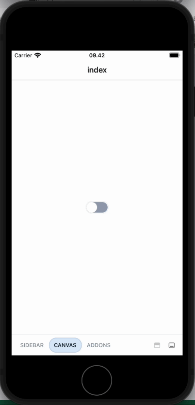
Switch
Control that allows users to turn on or off item

Component Status Details
Status component contains a list of checks and completeness that has been tested and owned by each component
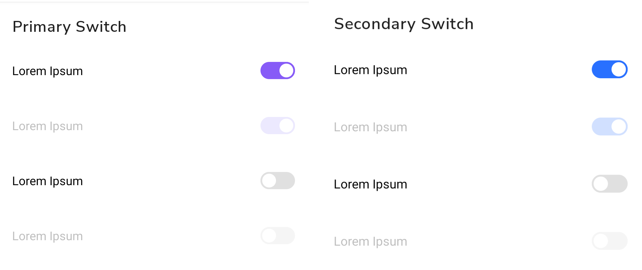
 We don't use color as the only visual tool to convey information. The component’s structure and properties include relevant options such as variant, style, size, orientation, optional iconography, decorations, selection, error state, etc. The title is the component name that uses the frame base component template. The base component name contains: .Base & "Component Name" if there is more than one. All component properties use the Legion foundation. We can change all the parts that are connected to the component base. The inside of the base component remains connected to the master component. All variant options are not damaged when we change from one to another. Overriding changes to components will not reset other variants. Component's already has component specs documentation.
Usage
Switch is component that allows the user to toggle between two states. Switch is usually used for implementing toggle based settings, where the user can change the setting parameters to either on or off.
An example on how to implement switch component in your app:
import { Switch } from "@legion-crossplatform/ui";const Switch = () => {return <Switch label="Switch Label" defaultChecked={false} size="$3" />;};
Example With Value Toggle
The following is example usage for switch implementation with value
import { Switch } from "@legion-crossplatform/ui";import { useState } from "react";const [checked, setChecked] = useState(false);const toggleCheckedChange = () => {setChecked(!checked);};

Props
| Parameter | Type | Description | Required |
|---|---|---|---|
value | any | Current value of the switch | No |
label | string | Text label for this switch | No |
onCheckedChange | (checked: boolean) => void | Callback in which value should be updated | No |
checked | boolean | Control for the input | Yes |
disabled | boolean | Set switch disabled or not | No |
labeledBy | string | Set aria-labeled-by | No |
required | boolean | Set aria-required | No |