Components
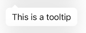
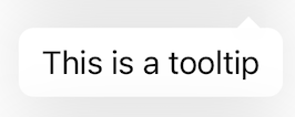
Tooltip
Shows additional context on tap or hover.

Component Status Details
Status component contains a list of checks and completeness that has been tested and owned by each component
 We don't use color as the only visual tool to convey information. The component’s structure and properties include relevant options such as variant, style, size, orientation, optional iconography, decorations, selection, error state, etc. The title is the component name that uses the frame base component template. The base component name contains: .Base & "Component Name" if there is more than one. All component properties use the Legion foundation. We can change all the parts that are connected to the component base. The inside of the base component remains connected to the master component. All variant options are not damaged when we change from one to another. Overriding changes to components will not reset other variants. Component's already has component specs documentation.
Usage
In general, there are two types of LGNTooltip content that you can use:
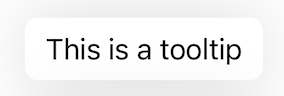
Text Tooltip
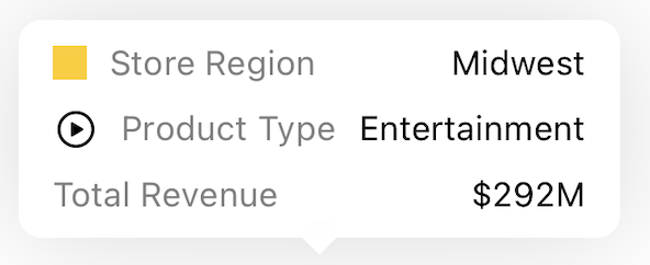
Custom View Tooltip
These tooltips can be shown in four positions:
Top Center
Bottom Center
Left
Right
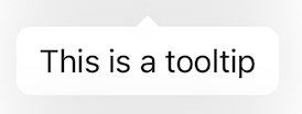
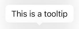
Additionally, tooltips support nine different arrow positions:
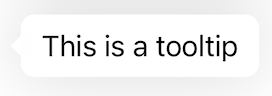
None (no arrow)
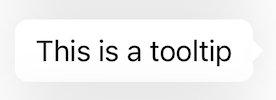
Right
Left
Bottom Center
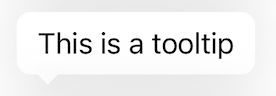
Bottom Left
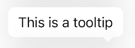
Bottom Right
Top Left
Top Center
Top Right
Variant
LGNTooltip has 2 content variants:
| Text | Custom View |
|---|---|
| Simple text tooltip | Custom view with any UI components |
Basic text tooltip:
let tooltip = BaseLGNTooltip()tooltip.tooltipPosition = .bottomCentertooltip.setContent(.text("This is a tooltip"))tooltip.show(in: parentView, relativeTo: buttonView)
Custom view tooltip:
let tooltip = BaseLGNTooltip()tooltip.tooltipPosition = .topCenterlet customView = UIView()// Configure your custom viewtooltip.setContent(.custom(customView))tooltip.show(in: parentView, relativeTo: buttonView)
Auto-dismissing tooltip:
let tooltip = BaseLGNTooltip()tooltip.tooltipPosition = .righttooltip.setContent(.text("Will dismiss in 5 seconds"))tooltip.show(for: 5, in: parentView, relativeTo: buttonView)
Non-dismissible tooltip:
let tooltip = BaseLGNTooltip()tooltip.tooltipPosition = .lefttooltip.setContent(.text("Can't dismiss this!"))tooltip.setDismissible(false)tooltip.show(in: parentView, relativeTo: buttonView)
Methods
The tooltip provides several methods for controlling its behavior:
// Show tooltiptooltip.show(in: parentView, relativeTo: referenceView)// Show tooltip with auto-dismisstooltip.show(for: timeInterval, in: parentView, relativeTo: referenceView)// Set contenttooltip.setContent(.text("Your text"))tooltip.setContent(.custom(yourView))
Example Code
class ViewController: UIViewController {private let exclamationMarkButton: UIButton = {let button = UIButton(type: .system)button.setImage(UIImage(systemName: "exclamationmark.circle"), for: .normal)button.translatesAutoresizingMaskIntoConstraints = falsereturn button}()
Properties
| Property | Description | Default Value |
|---|---|---|
| containerView | The main container view that holds the tooltip content. Has white background and shadow. | UIView with white background, corner radius 8, and shadow |
| contentView | The view that contains the actual content (label or custom view). | Empty UIView |
| isDismissible | Determines if the tooltip can be dismissed by tapping the reference view. | true |
| label | The label used to display text content in the tooltip. | UILabel with NunitoSans font, size 12, black text |
| position | The position of the arrow pointing from the tooltip. Can be .none, .right, .left, .bottomCenter, .bottomLeft, .bottomRight, .topLeft, .topCenter, or .topRight. | .none |
| referenceView | The view that the tooltip is associated with and points to. | nil |
| tooltipPosition | The position where the tooltip should appear relative to the reference view. Can be .right, .left, .bottomCenter, or .topCenter. | .bottomCenter |