Components
Slider
A slider component is a user interface element that enables users to select a value from a continuous range by dragging a handle along a track.
Component Status Details
Status component contains a list of checks and completeness that has been tested and owned by each component
 We don't use color as the only visual tool to convey information.
 The component’s structure and properties include relevant options such as variant, style, size, orientation, optional iconography, decorations, selection, error state, etc.
 The title is the component name that uses the frame base component template.
 The base component name contains: .Base & "Component Name" if there is more than one.
 All component properties use the Legion foundation.
 We can change all the parts that are connected to the component base.
 The inside of the base component remains connected to the master component.
 All variant options are not damaged when we change from one to another.
 Overriding changes to components will not reset other variants.
 Component's already has component specs documentation.
Usage
A slider component is a user interface element that enables users to select a value from a continuous range by dragging a handle along a track.

Example
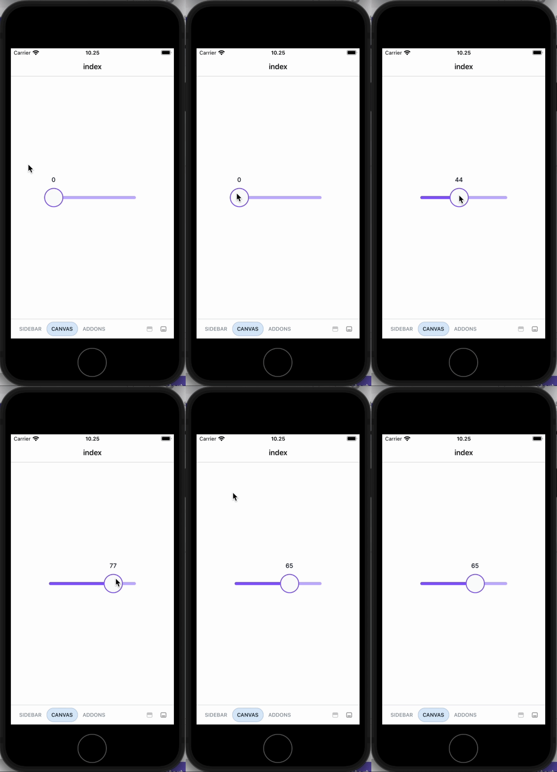
Slider with Value useState
import { Slider } from '@legion-crossplatform/ui';import { useState } from 'react';const [value, setValue] = useState([20]);const Slider = () => {return (<Sliderwidth={200}
Vertical Slider
import { Slider } from '@legion-crossplatform/ui';const Slider = () => {return (<Sliderorientation="vertical"height={200}/>)
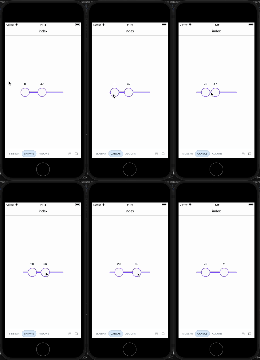
Ranged Slider

import { Slider } from '@legion-crossplatform/ui';import { useState } from 'react';const [value, setValue] = useState([20,50]);const Slider = () => {return (<Sliderwidth={200}
Props
| Parameters | Type | Description | Required |
|---|---|---|---|
| dir | ltr | rtl | Controls the side the active track appears on. | No |
| defaultValue | number[] | Uncontrolled starting value. | No |
| disabled | boolean | Set slider disabled or not. | No |
| minStepsBetweenThumbs | number | Minimum steps between thumbs. | No |
| name | string | Name of the slider. For usage with Forms. | No |
| max | number | Maximum value. | No |
| min | number | Minimum value. | No |
| onValueChange | (value: number[])=> void | Callback in which value should be updated | No |
| orientation | horizontal | vertical | Direction of the slider. | No |
| onSlideEnd | (event, value: number) => void | Called on slide end. | No |
| onSlideMove | (event, value: number) => void | Called on slide move. | No |
| onSlideStart | (event, value: number, target) => void | Called on slide start. | No |
| size | SizeTokens | Size of the slider. | No |
| step | number | Minimum thumb move distance. | No |
| value | number[] | Current value of the slider. | No |