Components
Select
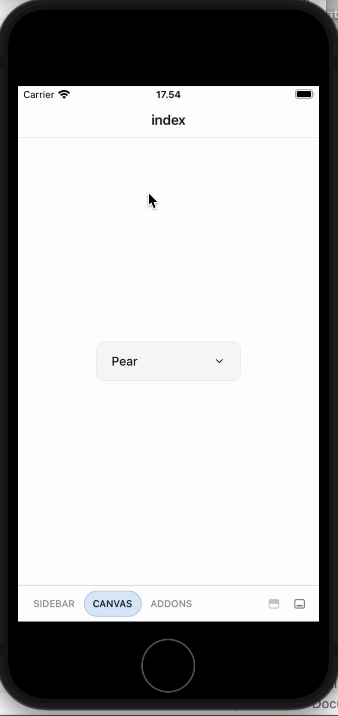
Allows users to choose one option from a list of items

Component Status Details
Status component contains a list of checks and completeness that has been tested and owned by each component
 We don't use color as the only visual tool to convey information. The component’s structure and properties include relevant options such as variant, style, size, orientation, optional iconography, decorations, selection, error state, etc. The title is the component name that uses the frame base component template. The base component name contains: .Base & "Component Name" if there is more than one. All component properties use the Legion foundation. We can change all the parts that are connected to the component base. The inside of the base component remains connected to the master component. All variant options are not damaged when we change from one to another. Overriding changes to components will not reset other variants. Component's already has component specs documentation.
Usage
Select component to select value from options.
import { Select, Text, View } from '@legion-crossplatform/ui';import { useState, useEffect } from 'react'export function SelectScreen() {const items = [{ name: 'Apple' },{ name: 'Pear' },{ name: 'Blackberry' },
Props
| Parameter | Default Value | Description |
|---|---|---|
| caption | N/A | Caption for select component |
| hint | N/A | Hint text for select component |
| id | N/A | Optional for usage with Label |
| item | N/A | Array of items to be displayed in the select component. |
| label | N/A | Label for select component. |
| onValueChange | N/A | Callback on value change. |
| placeholder | N/A | Placeholder for select component |
| size | N/A | Set the size of itself and pass to all inner elements. |
| value | N/A | Controlled value. |