Components
Dropdown
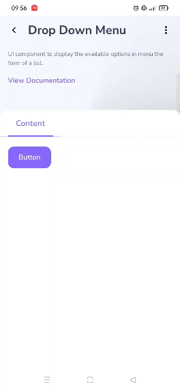
Dropdowns are used to display a list of user-selectable actions or options

Component Status Details
Status component contains a list of checks and completeness that has been tested and owned by each component
 We don't use color as the only visual tool to convey information. The component’s structure and properties include relevant options such as variant, style, size, orientation, optional iconography, decorations, selection, error state, etc. The title is the component name that uses the frame base component template. The base component name contains: .Base & "Component Name" if there is more than one. All component properties use the Legion foundation. We can change all the parts that are connected to the component base. The inside of the base component remains connected to the master component. All variant options are not damaged when we change from one to another. Overriding changes to components will not reset other variants. Component's already has component specs documentation.
Dropdowns are used to display a list of user-selectable actions or options
Usage
The following is code to implement Dropdown component.
data class DropdownItem(override val id: Int,override val label: String,override val iconLeft: ImageVector? = null,override val iconRight: ImageVector? = null,override val divider: Boolean = false,override val enabled: Boolean = true) : ILgnDropdownMenuItem
Attributes
| Parameters | Type | Description |
|---|---|---|
| data | List | Add List Data Dropdown |
| expanded | Boolean | Set Whether The Dropdown is Expand or Not |
| onDismissRequest | Function | Set Action When The Dropdown is Dismiss |
| offset | DpOffset | Set Size Offset of Dropdown |
| scrollstate | ScrollState | Set Scroll State of Dropdown |
| properties | PopupProperties | Set Pop Up Properties of Dropdown |
| onClickItem | Function | Set Action When The Item of Dropdown is Clicked |
| button | Composable | Set Button For Open and Close Dropdown |