Components
Divider
Used to bring clarity and structure to a layout

Component Status Details
Status component contains a list of checks and completeness that has been tested and owned by each component
 We don't use color as the only visual tool to convey information. The component’s structure and properties include relevant options such as variant, style, size, orientation, optional iconography, decorations, selection, error state, etc. The title is the component name that uses the frame base component template. The base component name contains: .Base & "Component Name" if there is more than one. All component properties use the Legion foundation. We can change all the parts that are connected to the component base. The inside of the base component remains connected to the master component. All variant options are not damaged when we change from one to another. Overriding changes to components will not reset other variants. Component's already has component specs documentation.
Usage
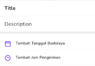
A divider separates your content usually in between top and bottom.
Basic
The LgnDivider is a view that can be used in layouts to separate content into clear groups.
Note: Make sure to set android:layout_height="wrap_content" on the LgnDivider to ensure that the correct size is set for the divider.
The full-bleed divider is displayed below:

Static in xml
<com.telkom.legion.component.dividers.LgnDividerandroid:layout_width="match_parent"android:layout_height="wrap_content"android:layout_marginTop="@dimen/dimen_16dp" />
Dynamic using Kotlin*
...with(binding) {containerBase.addView( //ViewGroup for Dynamic LayoutLgnDivider(requiredContext()).apply {//Your View's customization here},LinearLayout.LayoutParams( //For example we use viewgroup LinearLayoutLinearLayout.LayoutParams.MATCH_PARENT,LinearLayout.LayoutParams.WRAP_CONTENT
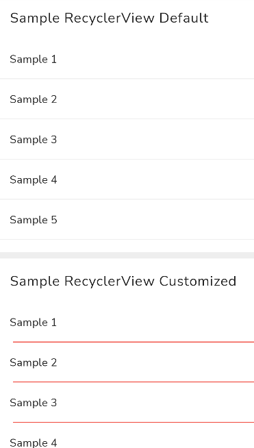
By default, dividers will be full-bleed. You can use app:dividerInsetStart and app:dividerInsetEnd to achieve the look of an inset or middle divider:
<com.telkom.legion.component.dividers.LgnDividerandroid:layout_width="match_parent"android:layout_height="wrap_content"app:dividerInsetStart="16dp"app:dividerInsetEnd="16dp"/>
Integrate with RecyclerView
Integrate divider with your recyclerview
In your fragment or activity
Basic Configuration
...with(binding) {//By Default orientation has been set with VERTICAL//And without customization view'srvSampleCustom.setLegionDivider()}...
Advanced Configuration
...with(binding) {rvSampleCustom.setLegionDivider(//Fill with your recyclerview orientation//VERTICAL or HORIZONTALorientation = LgnDividerItemDecoration.VERTICAL,context = requireContext()) {//Your View's customization here
Attributes
| Attribute Name | Xml Attrs | Related method(s) | Description |
|---|---|---|---|
| Thickness | app:dividerThickness | dividerThickness | To set thickness of dividers directly via xml |
| Color | app:dividerColor | dividerColor | To set dividers color directly via xml |
| Start inset | app:dividerInsetStart | dividerInsetStart | To set padding start of dividers directly via xml |
| End inset | app:dividerInsetEnd | dividerInsetEnd | To set padding end of dividers directly via xml |