Components
Bottom Sheet
The bottom sheet is a slides from the bottom of the screen

Component Status Details
Status component contains a list of checks and completeness that has been tested and owned by each component
 We don't use color as the only visual tool to convey information. The component’s structure and properties include relevant options such as variant, style, size, orientation, optional iconography, decorations, selection, error state, etc. The title is the component name that uses the frame base component template. The base component name contains: .Base & "Component Name" if there is more than one. All component properties use the Legion foundation. We can change all the parts that are connected to the component base. The inside of the base component remains connected to the master component. All variant options are not damaged when we change from one to another. Overriding changes to components will not reset other variants. Component's already has component specs documentation.
Usage
The bottom sheet is a slides from the bottom of the screen Whereas a bottom navigation component is for buttons and specific application level actions, a bottom sheet can contain anything.
Legion iOS UIKit offers five themes:
ThemeAGRUIKitThemeEazyUIKitThemeIHSUIKitThemeLGNUIKitThemeMyTEnSUIKit.
To import a theme, use the following syntax:
import ThemeLGNUIKit
Header Options
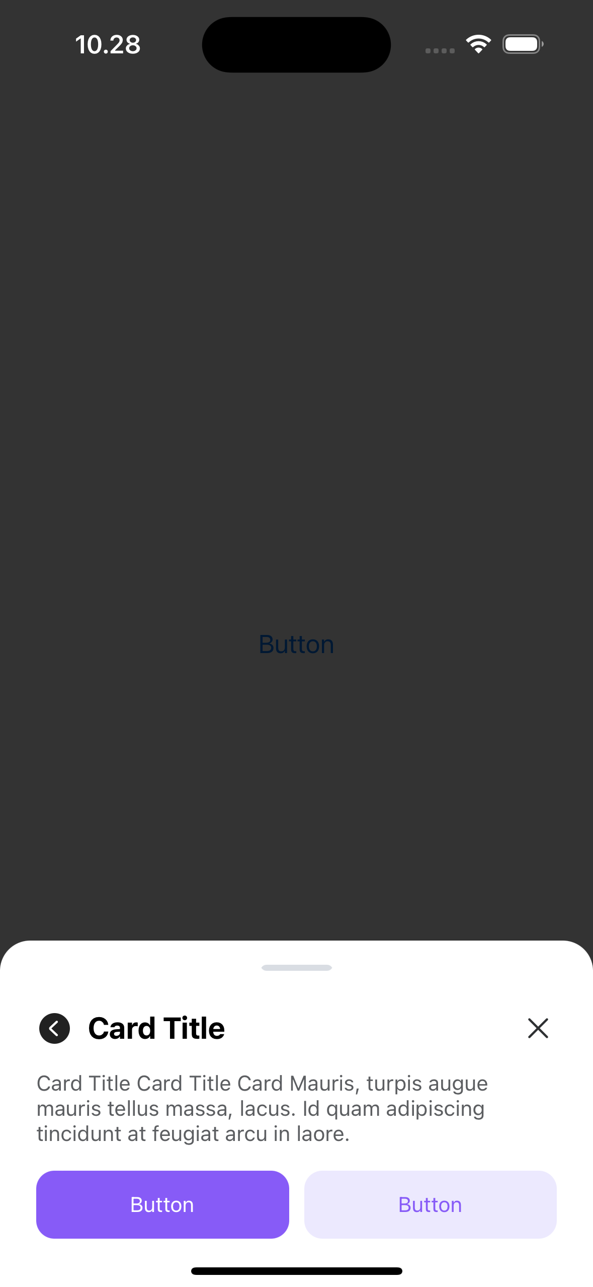
Header with title
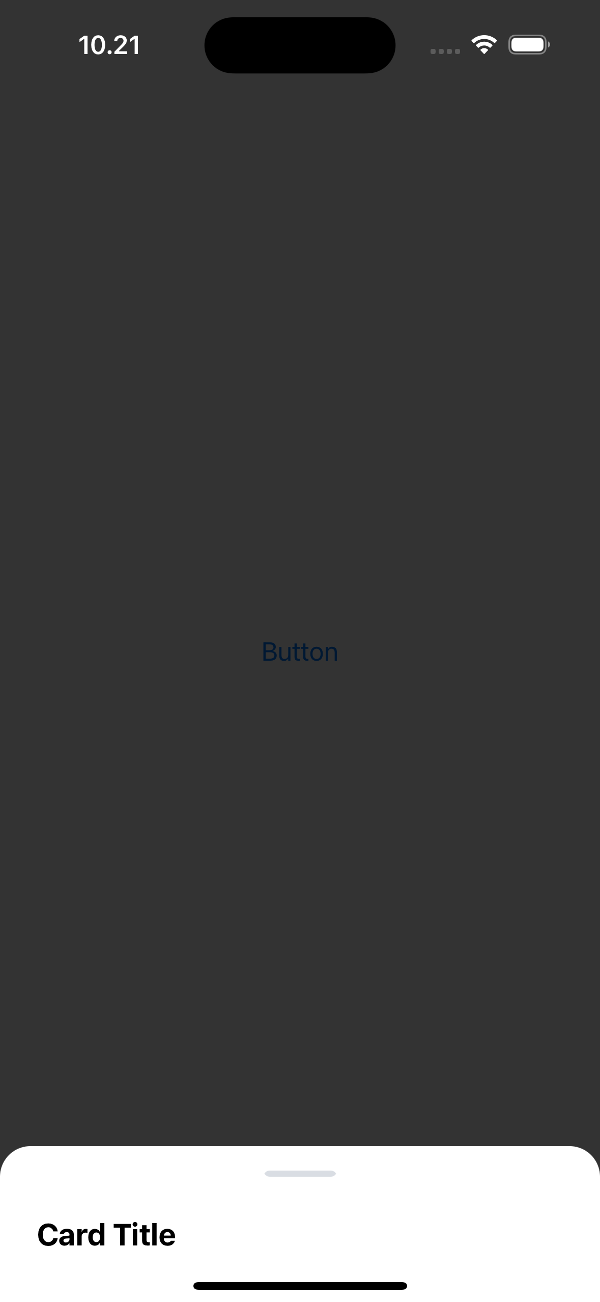
let bottomSheetVc = LGNBottomSheetUIKit(title: "Card Title")presentBottomSheet(viewController: bottomSheetVc)
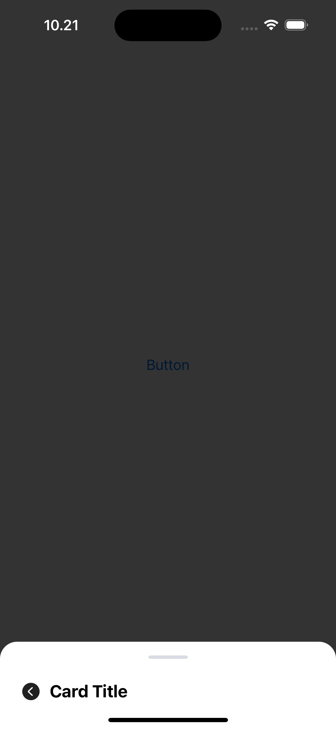
Header with title and left icon
let bottomSheetVc = LGNBottomSheetUIKit(title: "Card Title",leftIcon: UIImage(systemName: "chevron.left.circle.fill"))presentBottomSheet(viewController: bottomSheetVc)
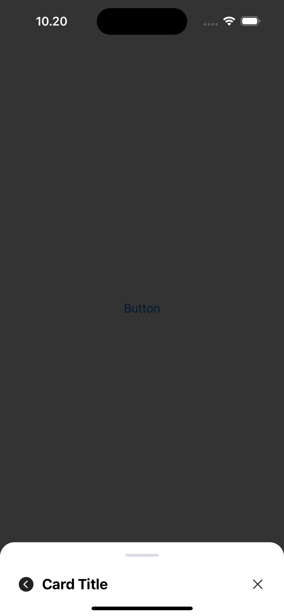
Header with title, left icon and close button
let bottomSheetVc = LGNBottomSheetUIKit(title: "Card Title",leftIcon: UIImage(systemName: "chevron.left.circle.fill"),showCloseButton: true)
Body
Body property can be either:
- .text(String)
- .custom(UIView)
Body Text
Type .text(String): An optional body with input text string. If not provided, it defaults to nil.
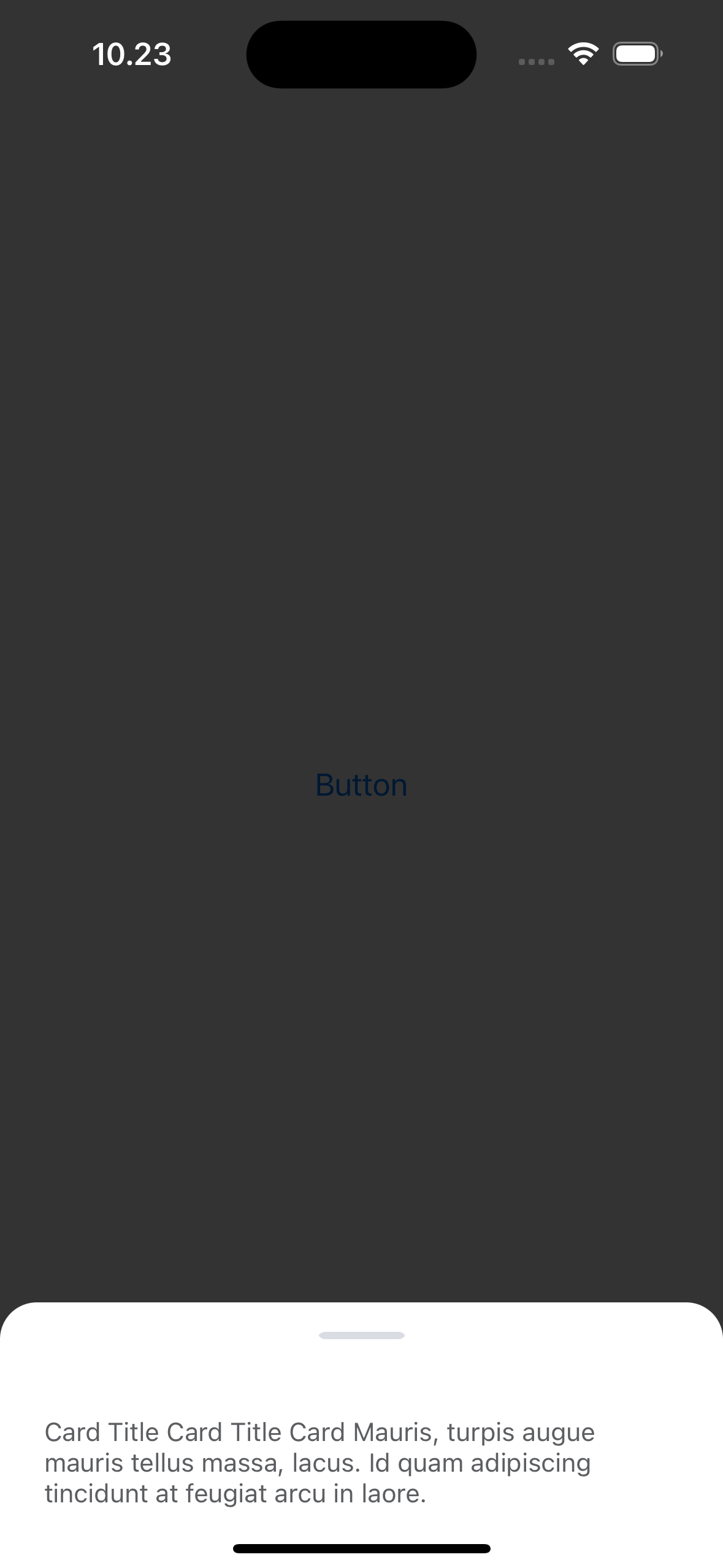
let sampleText = "Mauris, turpis augue mauris tellus massa, lacus. Id quam adipiscing tincidunt at feugiat arcu in laore."let bottomSheetVc = LGNBottomSheetUIKit(body: .text(sampleText))presentBottomSheet(viewController: bottomSheetVc)
Body Custom
Type .custom(UIView): An optional body with any custom UIView. If not provided, it defaults to nil.
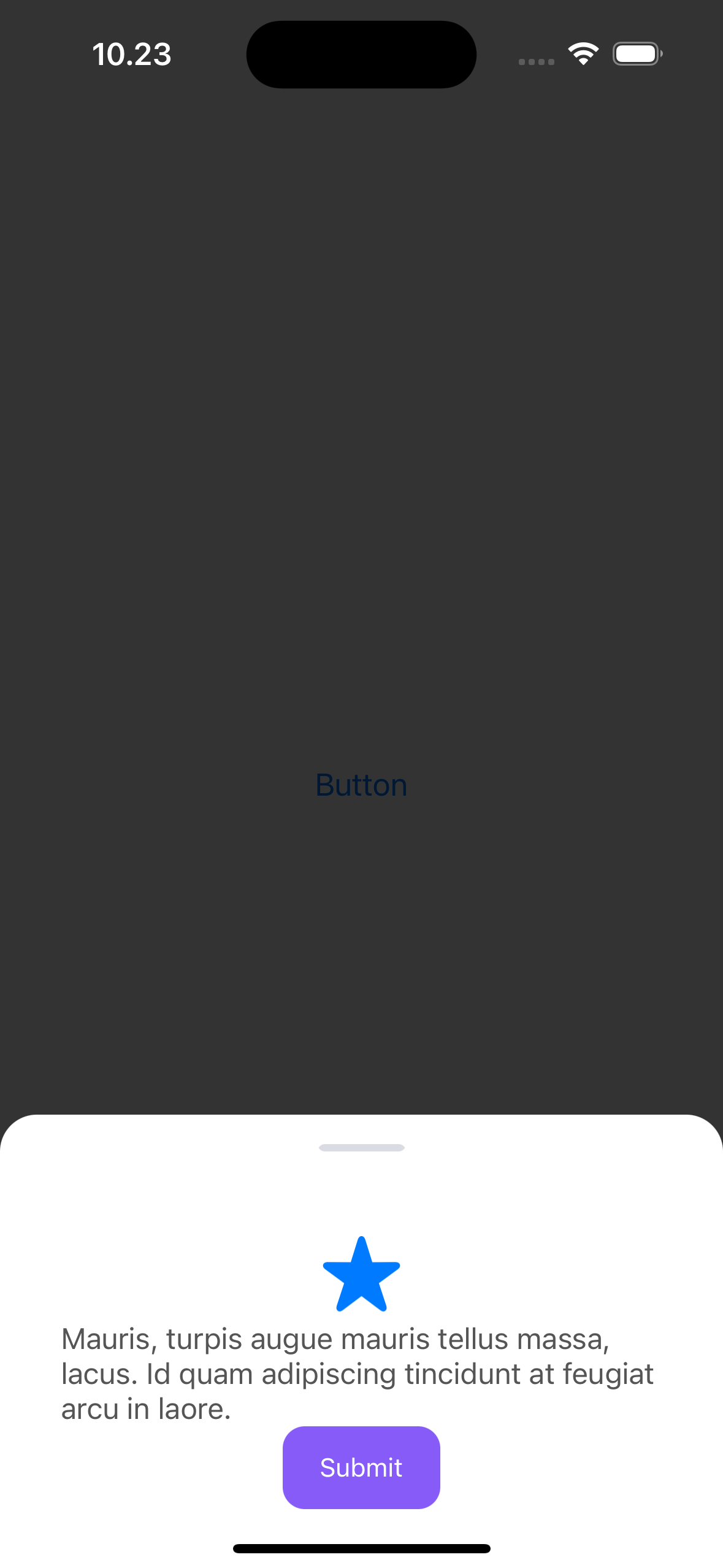
func createSampleCustomView() -> UIView {let imageView = UIImageView()imageView.image = UIImage(systemName: "star.fill")imageView.tintColor = .systemBlueimageView.contentMode = .scaleAspectFitimageView.translatesAutoresizingMaskIntoConstraints = falseimageView.heightAnchor.constraint(equalToConstant: 50).isActive = trueimageView.widthAnchor.constraint(equalToConstant: 50).isActive = true
Footer
Footer property can be one of the following:
- .single(LGNButton): An optional footer with a single LGNButton type. If not provided, it defaults to nil.
- .double(LGNButton, LGNButton): An optional footer with two LGNButton types that appear in a horizontal stack. If not provided, it defaults to nil.
- .stack(LGNButton, LGNButton): An optional footer with two LGNButton types that appear in a vertical stack. If not provided, it defaults to nil.
- .triple(LGNButton, LGNButton, LGNButton): An optional footer with three LGNButton types that appear in a horizontal stack. If not provided, it defaults to nil.
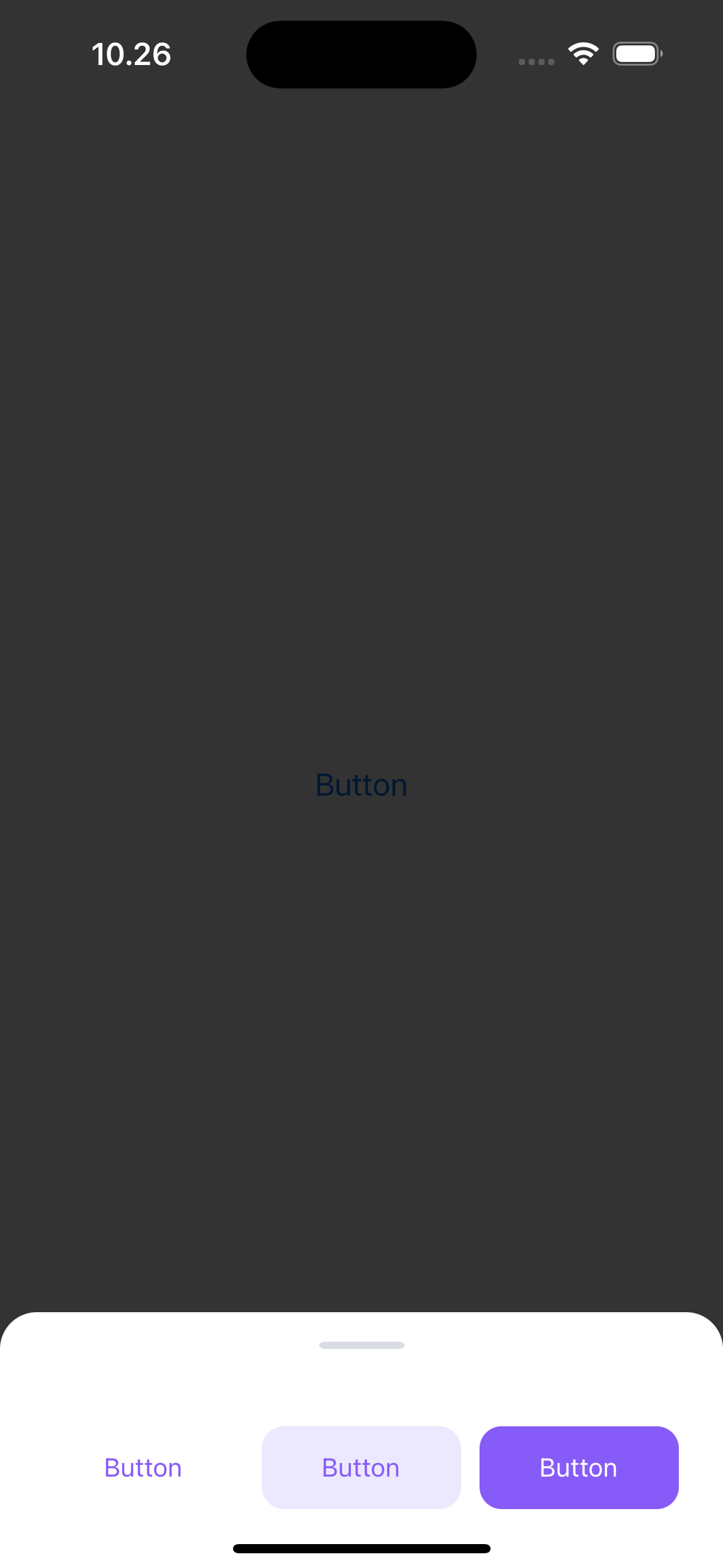
Footer Single
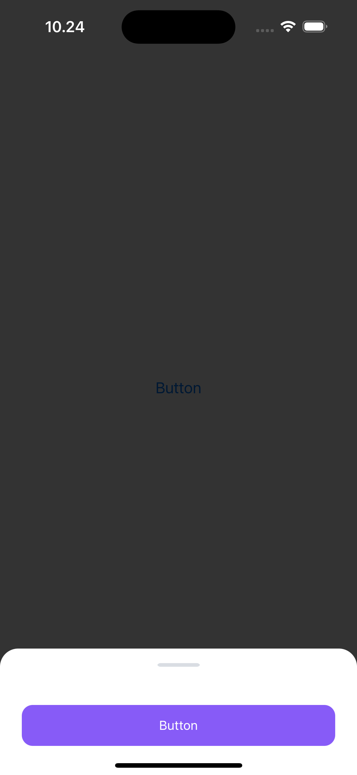
let button1 = LGNButton()button1.label = "Button"button1.variant = .solidlet bottomSheetVc = LGNBottomSheetUIKit(footer: .single(button1))presentBottomSheet(viewController: bottomSheetVc)
Footer Double
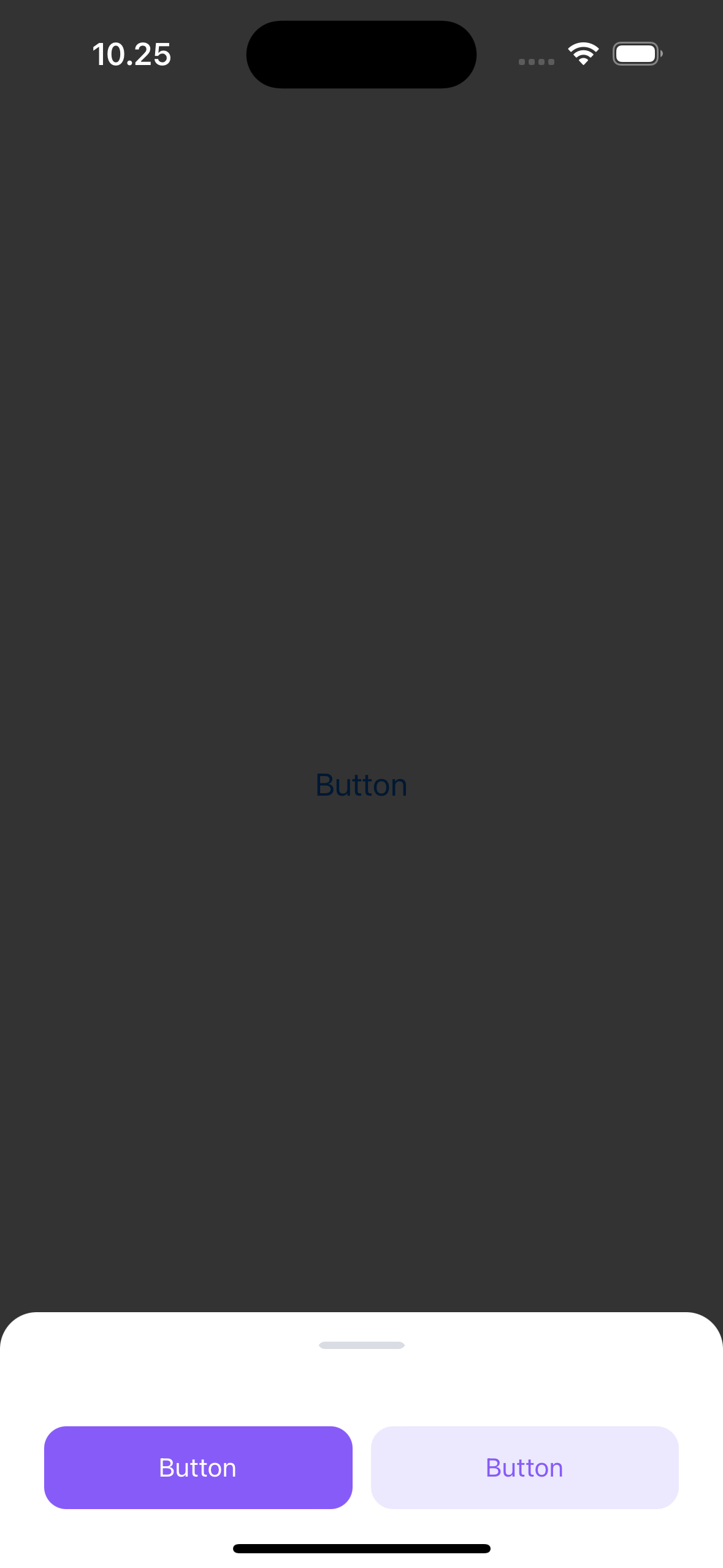
let button1 = LGNButton()button1.label = "Button"button1.variant = .solidlet button2 = LGNButton()button2.label = "Button"button2.variant = .softlet bottomSheetVc = LGNBottomSheetUIKit(
Footer Stack
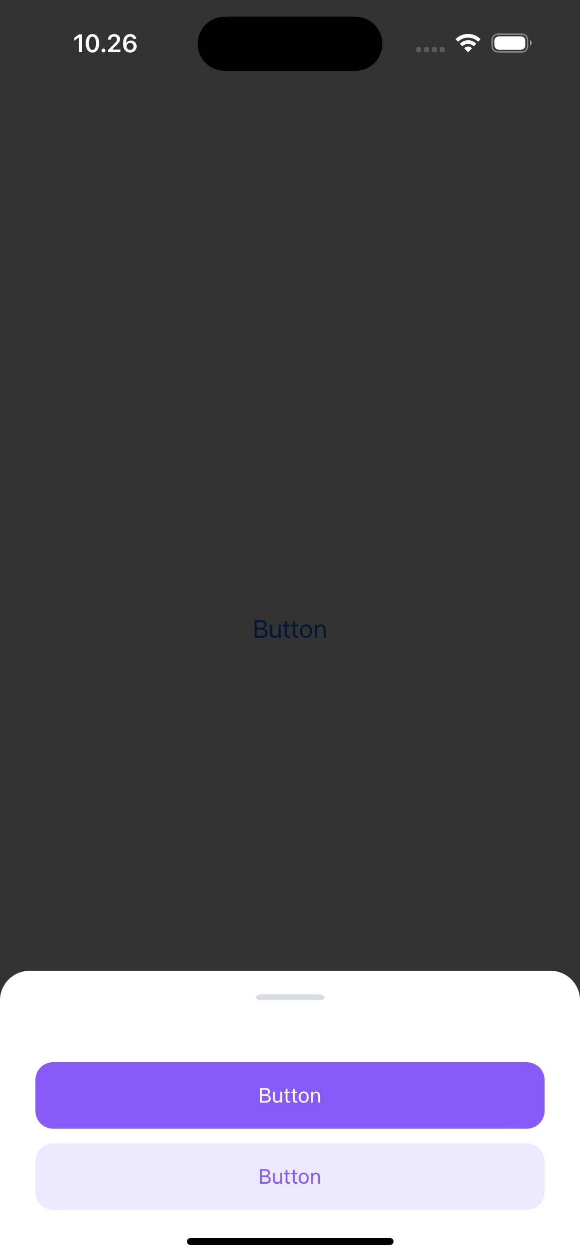
let button1 = LGNButton()button1.label = "Button"button1.variant = .solidlet button2 = LGNButton()button2.label = "Button"button2.variant = .softlet bottomSheetVc = LGNBottomSheetUIKit(
Footer Triple
let button1 = LGNButton()button1.label = "Button"button1.variant = .transparentlet button2 = LGNButton()button2.label = "Button"button2.variant = .softlet button3 = LGNButton()
Full Configuration
let button1 = LGNButton()button1.label = "Button"button1.variant = .solidlet button2 = LGNButton()button2.label = "Button"button2.variant = .softlet sampleText = "Mauris, turpis augue mauris tellus massa, lacus. Id quam adipiscing tincidunt at feugiat arcu in laore."
Properties
| Properties | Description | Default Value |
|---|---|---|
| body | Optional body content, can be either .text(String) or .custom(UIView) | nil |
| closeButton | Optional close button displayed after the title | false |
| footer | Optional footer content, can be .single(LGNButton), .double(LGNButton, LGNButton), .stack(LGNButton, LGNButton), or .triple(LGNButton, LGNButton, LGNButton) | nil |
| leftIcon | Optional icon displayed to the left of the title | nil |
| showOverlay(_:) | Function to show or hide the overlay | true |
| setIsDismissable(_:) | Function to set if the bottom sheet is dismissable | true |
| title | Optional title for the bottom sheet | "" |